The Widgetkit Spotlight allows you to add an overlay to your images which fades or moves in on mouse hover. The overlay can be an image or HTML content. The default magnifier spotlight is a perfect match to be used with a lightbox.
Features
Create nicely animated image overlays
Supports custom image or HTML content overlays
5 different animation modes
Responsive design to fit all device resolutions
Built with the latest jQuery version
Works with Joomla and WordPress
Examples
If no custom overlay is set the default spotlight fades in an overlay with an magnifier image. If you define a custom overlay you can choose between different animations - fade, bottom, top, right and left.
Lorem ipsum dolor sit amet, consectetur adipisicing elit, sed do eiusmod tempor incididunt ut labore et dolore magna aliqua. Ut enim ad minim veniam, quis nostrud exercitation ullamco laboris nisi ut aliquip ex ea commodo consequat. Duis aute irure dolor in reprehenderit in voluptate velit esse cillum dolore eu fugiat nulla pariatur. Excepteur sint occaecat cupidatat non proident, sunt in culpa qui officia deserunt mollit anim id est laborum.
Load Widgets In A Lightbox
Use #wk-ID to load widgets like slideshows or galleries in a lightbox. For example: Widgetkit Slideshow
Use the HTML5 custom data attribute data-lightbox to activate the lightbox. You can set various lightbox parameters to the data attribute. For example:
The Widgetkit Slideshow is the ultimate image and content slideshow for Joomla and WordPress. It's flexible, easy to customize and completely build with HTML5 and CSS3.
Features
Clean and very lightweight code
17 eye-catching transition effects
Fully responsive including all effects
Uses hardware accelerated CSS3 animations
Support for HTML captions
Swipe navigation on mobile phones
Built with HTML5, CSS3, PHP 5.2+, and the latest jQuery version
Works with Joomla and WordPress
Slideshow Screen Example
This is an image slideshow with the famous Ken Burns effect.
This is an image slideshow with some nice navigation buttons. You can place any kind of HTML in the navigation buttons.
Item 1
Item 2
Item 3
Item 4
Tabs Example
This is a classic, tabbed slideshow. Tabs can be aligned to the left, right and center.
Tab One
Tab Two
Tab Three
Headline
Lorem ipsum dolor sit amet, consectetur adipisicing elit, sed do eiusmod tempor incididunt ut labore et dolore magna aliqua.
Headline
Lorem ipsum dolor sit amet, consectetur adipisicing elit, sed do eiusmod tempor incididunt ut labore et dolore magna aliqua.
Headline
Lorem ipsum dolor sit amet, consectetur adipisicing elit, sed do eiusmod tempor incididunt ut labore et dolore magna aliqua.
Tabs Bar Example
This is a slideshow with a tabbed navigation bar. Tabs can be aligned to the left, right and center.
Tab One
Tab Two
Tab Three
Headline
Lorem ipsum dolor sit amet, consectetur adipisicing elit, sed do eiusmod tempor incididunt ut labore et dolore magna aliqua.
Headline
Lorem ipsum dolor sit amet, consectetur adipisicing elit, sed do eiusmod tempor incididunt ut labore et dolore magna aliqua.
Headline
Lorem ipsum dolor sit amet, consectetur adipisicing elit, sed do eiusmod tempor incididunt ut labore et dolore magna aliqua.
List Example
This is a slideshow with a vertical tabbed list as navigation.
Item One
Item Two
Item Three
Headline
Lorem ipsum dolor sit amet, consectetur adipisicing elit, sed do eiusmod tempor incididunt ut labore et dolore magna aliqua.
Lorem ipsum dolor sit amet, consectetur adipisicing elit, sed do eiusmod tempor incididunt ut labore et dolore magna aliqua.
Headline
Lorem ipsum dolor sit amet, consectetur adipisicing elit, sed do eiusmod tempor incididunt ut labore et dolore magna aliqua.
Lorem ipsum dolor sit amet, consectetur adipisicing elit, sed do eiusmod tempor incididunt ut labore et dolore magna aliqua.
Headline
Lorem ipsum dolor sit amet, consectetur adipisicing elit, sed do eiusmod tempor incididunt ut labore et dolore magna aliqua.
Lorem ipsum dolor sit amet, consectetur adipisicing elit, sed do eiusmod tempor incididunt ut labore et dolore magna aliqua.
How To Use
The Widgetkit Slideshow takes full advantage of the very user-friendly Widgetkit administration user interface. It has never been easier to create and manage all the slideshows and their different slides in one place. After you created a slideshow you can load it anywhere in your theme using shortcodes or the universal Widgetkit Joomla module or WordPress widget.
Widgetkit is the next generation tool set for Joomla and WordPress. This toolkit is the first of its kind! It provides a simple and user-friendly way to enrich your websites experience with slideshows, galleries, lightboxes and much more. All widgets make use of modern web technologies like HTML5 markup, CSS3 features and jQuery based JavaScripts. Widgetkit is fully responsive and all widgets and their effects adapt perfectly for all device resolutions. It supports touch gestures and makes use of smooth CSS3 animations. Here is a short feature roundup:
Features
Available for Joomla and WordPress
All widgets are fully responsive
Use shortcodes to show widgets anywhere
Clean and lightweight code
Semantic HTML5 markup
Asset file minification and compression
Supports touch gestures for mobile devices
Uses hardware accelerated CSS3 animations
Built with HTML5, CSS3, PHP 5.2+, latest jQuery version
How It Works
Widgetkit basically acts as a platform for all our widgets. It installs as a single component in Joomla or as a plugin in WordPress. The Widgetkit dashboard presents you an overview of all widgets. You can create, edit or delete all widgets and their content in one place. And after you have created the content for your first widget you can either use a shortcode or a module to display your widget anywhere on your website. In fact you can do both because once have you created a widget you are able to display it multiple times and reuse it on different parts of your website.
This is the Master theme of our fast and slick Warp theme framework! It is optimized and streamlined to serve as a blueprint to build your own custom themes.
The Master theme takes full advantage of all the latest Warp6 features like a completely responsive layout, semantic HTML5 markup, a nice and clean administration UI and much more.
This theme utilizes the latest features of the fast and slick Warp theme framework. It comes with a broad range of layout and module variations as well as neat typography to style your content. Read on to learn more about this theme and its features:
Available for Joomla and WordPress
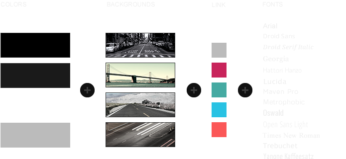
8 style variations available
Combine 4 background colors for the sidebar, content and background
Choose from 4 background photos and 13 fonts
3 module styles combinable with 4 badges and 6 icons
Fancy menu follower and smooth CSS animations (optional)
Left or centered website alignment
Fixed sidebar A (optional)
Custom Widgetkit slideshow style
Flexible template and column widths
All Warp framework features are available
Theme Styles
We provide different style variations of the default theme. Therefore to these styles we included several other style settings like colors and fonts. Combining the different style options allows you to create your own unique theme design.
Special Layout
Showroom comes with some cool layout options. We added the feature to change the alignment of your website: left or center. In addition to this you can completely fix the sidebar A. But don't worry, you can add as many modules as you want even if the sidebar is fixed. If the modules don't fit the site the sidebar scrolls automatically.
Site Alignment
Fixed Sidebar
Fixed Sidebar A Module
A cool feature is the possibility to combine the fixed sidebar with a fixed module like the social icons on the frontpage. To set up a fixed module add following code structure to one of the modules published in sidebar-a:
<div class="sidebar-a-bottom-fixed"> ... </div>
Theme Profiles
We created some nice theme profiles using the different styles, colors and fonts, you can choose from in the theme administration. You can create your own profiles and even assign them to different menu items. Click on one of the profile images to load it.
This theme comes with a customized Warp6 module layout. The blue module positions allow you to choose a module layout which defines the module alignment and proportions: equal, double or stack. You can easily add your own module layouts. The two available sidebars, highlighted red, can be switched to the left or right side and their widths can easily be set within the theme administration. For modules in the blue and red positions you can choose different module styles. Take a look at the module variations page to get an overview.
Module Positions
Module LayoutsColumn Layouts
Special Features
Featured Image
Showroom provides a great possibility to show your photography blog in a beautiful way using featured images, which benefit from the whole content width. To set up a blog like the one you can see on the theme frontpage just follow these steps:
Joomla: Add an Intro Image and a Full Article Image to your article in the Images and Links option
WordPress: Click Set featured image in the post and upload the image you want to add
Joomla: Set the Image Float to none
If you want a featured image within the content use following code structure to add an image:
You can also add a featured module (e.g. Slideshow) like you can see on the frontpage.
Create a slideshow in Widgetkit and copy the widget shortcode
Copy the following code structure and add it to a module/widget
<div class="featured-module">
  [widgetkit id=XX]
</div>
<h1>Title<h1>
<p>Lorem ipsum dolor sit amet...<p>
Custom Widgetkit Styles
We created a custom style for our Widgetkit Slideshow, perfectly fitting to the theme. To apply this style, follow these steps:
Slideshow
Download and unzip the bonus styles package for Widgetkit available in the download area
Copy the folder slideshow/styles/showroom
Joomla: Paste it to media/widgetkit/widgets/slideshow/styles
WordPress: Paste it to wp-content/plugins/widgetkit/widgets/slideshow/styles
Now you can select the style "Showroom" in the settings of your Widgetkit Slideshow
Social Icons
As a little extra, the Showroom theme offers a set of social icons. They are easy to add to your content and are part of our editable Adobe Fireworks Image Source Files.
Lorem ipsum dolor sit amet, consectetur adipisicing elit, sed do eiusmod tempor incididunt ut labore et dolore magna aliqua. Ut enim ad minim veniam, quis nostrud exercitation ullamco laboris nisi ut aliquip ex ea commodo consequat. Duis aute irure dolor in reprehenderit in voluptate velit esse cillum dolore eu fugiat nulla pariatur. Excepteur sint occaecat cupidatat non proident, sunt in culpa qui officia deserunt mollit anim id est laborum.
You can create some beautiful content by using some simple HTML elements. The Warp theme framework offers some neat styles for all HTML elements and a great set of CSS classes to style your content. Basic HTML is very easy to learn and this small guide shows you how to use all styles provided by the Warp framework.
Basic HTML Elements
Here is a short demonstration of text-level semanticts. The <p> element creates a new paragraph. It will have some space before and after itself. To turn your text into hypertext just use the <a> element.
Text-Level Semantics
You can emphasize text using the <em> element or to imply any extra importance the <strong> element. Highlight text with no semantic meaning using the <mark> element. Markup document changes like inserted or deleted text with the <del> element or <ins> element. To define an abbreviation use the <abbr> element and to define a definition term use the <dfn> element.
Short List with Links
YOOtheme - Premium Joomla Templates and WordPress Themes
Inline quotations can be defined by using the <q> element.
The <blockquote> element defines a long quotation which also creates a new block by inserting white space before and after the blockquote element.
To define a short inline computer code use the <code> element. For a larger code snippet use the <pre> element which defines preformatted text. It creates a new text block which preserves both spaces and line breaks.
Use the <small> element for side comments and small print.
Useful CSS Classes
Here is a short demonstration of all style related CSS classes provided by the Warp framework.
Highlight Content
Drop caps are the first letter of a paragraph which are displayed bigger than the rest of the text. You can create a drop cap using the CSS class dropcap. To emphasize text with some small boxes use <em> element with the CSS class box.
This simple box is intended to group large parts of your content using the CSS class box-content.
This is a simple box to highlight some text using the CSS class box-note.
This is a simple box with useful information using the CSS class box-info.
This is a simple box with important notes and warnings using the CSS class box-warning.
This is a simple box with additional hints using the CSS class box-hint.
This is a simple box with download information using the CSS class box-download.
Use the CSS class dotted to create a dotted horizontal rule.
Tables
Create a zebra stripped table using using the CSS class zebra.
Table caption
Table Heading
Table Heading
Table Heading
Table Footer
Table Footer
Table Footer
Table Data
Table Data
Data Centered
Data Bold
Table Data
Data Centered
Table Data
Table Data
Data Centered
Definition Lists
Create a nice looking definition list separated with a line by using the CSS class separator.
Definition List
A definition list is a list of terms and corresponding definitions. To create a definition list use the <dl> element in conjunction with <dt> to define the definition term and <dd> to define the definition description.
Definition Term
This is a definition description.
Definition Term
This is a definition description.
This is another definition description.
Forms
Create a clearly arranged form layout with fieldset boxes using the CSS class box.


 Item 1
 Item 2
 Item 3
 Item 4
 Item 5
 Item 6
 Item 7
 Item 8


